CelcomDigi
DotLabs Design System
One shared foundation for every CelcomDigi app, store and sales tool.
When Celcom and Digi merged, two teams, two apps and two design languages had to become one. DotLabs is the CelcomDigi design system that came out of that work: foundations, tokens and components shared by the Consumer App, the Sales App and the Online Store. It is now on version 1.32.
- Client
- CelcomDigi
- My role
- UX/UI and design system
- Platform
- Figma library · App & web
- Component libraries
- 33
- Design variables
- 185
- Colour styles
- 273
- Breakpoints
- 4
How it is built
One foundation, three products.
DotLabs is built in layers. Shared foundations and core components sit at the bottom and are used everywhere. Each product then adds its own library on top for what only it needs.
That way a button, a colour or a spacing value is decided once, and every team inherits the change.
Consumer App
- Navigation
- Form elements
- App icons
- Animation
Sales App
- Sales navigation
- Inventory
- Product catalogue
- Order management
Online Store
- Product cards
- Filtering
- Shipping & delivery
- Promotions
Webflow components, run by the web team
DotLabs foundations
- Colours
- Typography
- Logos
- Icons
- Shadows
- Grids & spacing
- Buttons, toggles, checkboxes
- 01
Primitives
102 raw colour values, from Bright Blue to Digi Yellow
- 02
Modes
15 semantic colours with light and dark values
- 03
Scales
Spacing, radius, type sizes and breakpoints
- 04
Components
Built only from the tokens above
Where it started
From Celcom CL3.0 to CelcomDigi.
Before the merger, the Celcom CL3.0 guideline set the rules for the Celcom app: a 360 × 640 pt base screen and an 8-point system, across 22 topics from spacing and navigation to banners and copy length.
DotLabs started from the Untitled UI kit and was rebranded to CelcomDigi: colours adjusted to the corporate identity, type split into desktop and mobile versions, and every component rebuilt with CelcomDigi tokens.
Our process
How a change gets into the system.
Every addition follows the same path, so the library stays reliable while many designers contribute.
- 1
Design
Build or change the component and mark it for review.
- 2
Log
Record it in the change log as Added, Changed or Removed, with a link.
- 3
Review
A reviewer checks properties, auto layout, layers and variants.
- 4
Approve
Only approved work moves on.
- 5
Publish
Publish the library with a description of what changed.
- 6
Announce
Share the update with every product team in the publishing channel.
Typography
Two typefaces, one scale.
Montserrat for headings and Lato for body text. Every size is a token with a desktop and a mobile value, so screens adapt without redesigning.
Colours
Two brands in one palette.
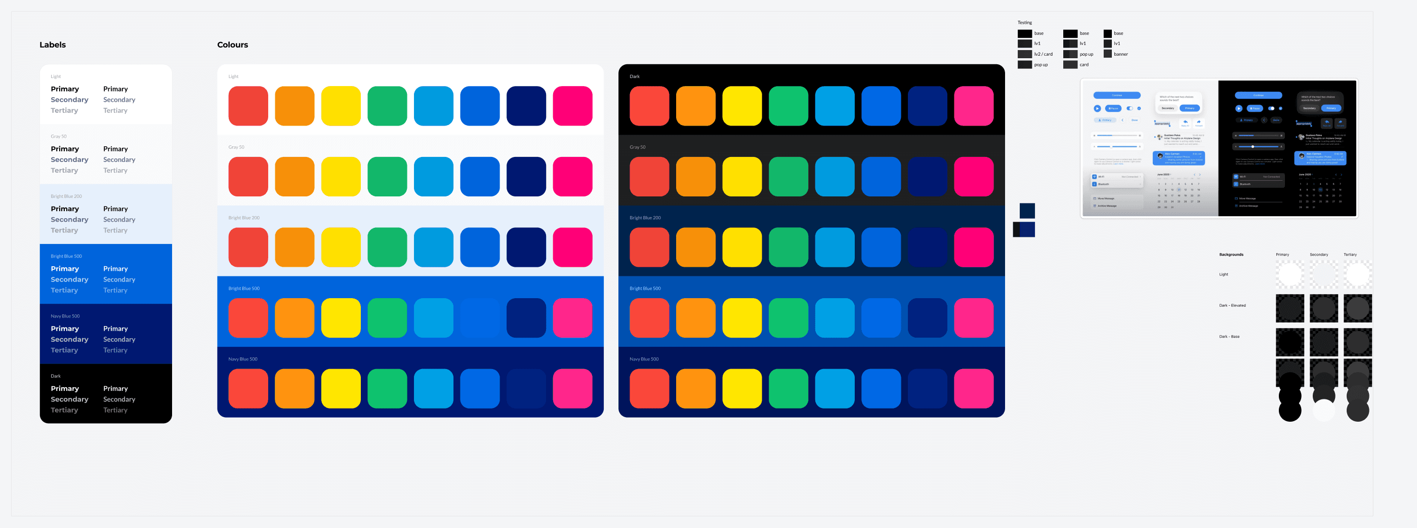
Celcom Blue and Digi Yellow sit side by side with Bright Blue and Navy, each in 11 steps. Status colours and neutrals complete the set, and WCAG 2.1 contrast ratios are built into the colour system.
Grids & spacing
Every number is a token.
Spacing, corner radius and screen sizes are variables, so designers pick from the scale instead of typing values, and developers get the same names in code.
- 4
- 8
- 12
- 16
- 20
- 24
- 28
- 32
- 40
- 48
- 56
- sm4
- md6
- lg8
- xl12
- 2xl16
- 3xl24
- 4xl32
- full∞
- 1440Desktop
- 768Tablet
- 720Unfolded mobile
- 375Mobile
Components
Buttons
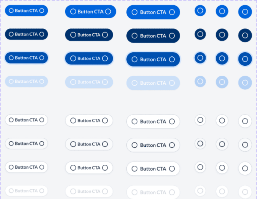
Seven styles, from primary to link, each in three sizes and four states, with destructive and icon-only versions.
- 288
- Variants
- 7
- Styles
- 4
- States
Components
Inputs
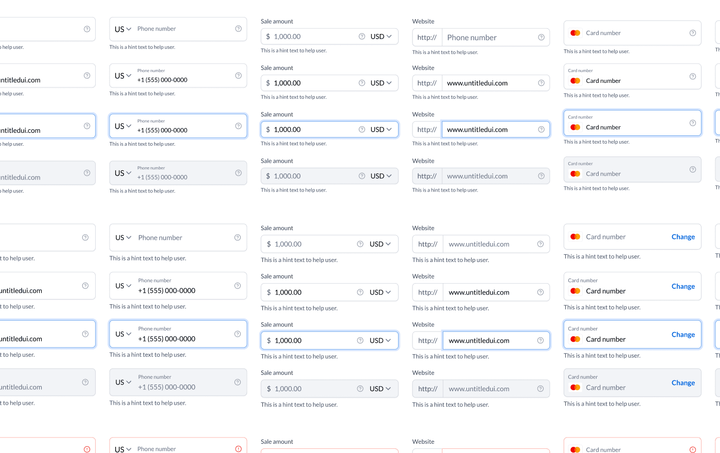
Text, phone, amount, website and card fields, each with placeholder, filled, focused, disabled and error states, and padding matched across mobile and desktop.
- 119
- Variants
- 8
- Types
- 3
- Sizes
Components
Navigation
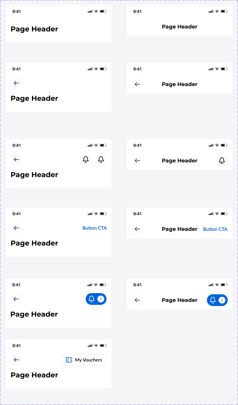
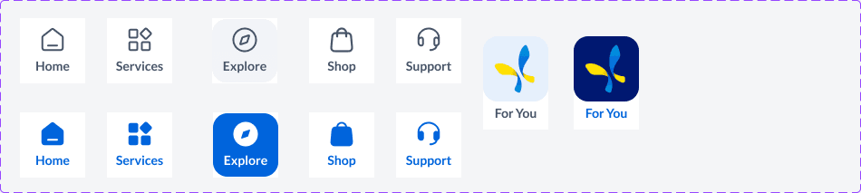
Page headers for every case (back, actions, a call to action, notifications) and the bottom app bar with selected and unselected tabs.
- 11
- Header variants
- 12
- Tab states
Themes
Light and dark from the same tokens.
Text and surface colours are semantic tokens with a light and a dark value, so a screen switches theme without being redrawn.
My Plan
Renews tomorrow, 5.55pm
My Plan
Renews tomorrow, 5.55pm
An example card drawn with the DotLabs light and dark colour values.
Governance
A living system.
Every change is logged. A few moments from the change log:
- Mar 2023
Colours adjusted to the corporate identity. Typography split into desktop and mobile versions. All button states rebuilt.
- Spring 2023
Updated to the Untitled UI v3.2 base and rebranded to CelcomDigi colours.
- Jun 2023
Input padding reconfigured to match heights across mobile and desktop. Bank logos and new icons added.
- Jul 2023
Variables introduced for padding and radius. New mobile font sizes.
- Oct 2023
Brand colours refined: Bright Blue, Digi Yellow and Celcom Blue. Space Blue added.
- 2024–2025
Ongoing releases through April 2025, now at version 1.32.