CelcomDigi
CelcomDigi App
Built from scratch for two customer bases, and launched to more than 4 million users.
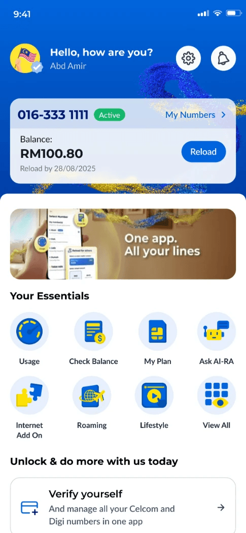
After the merger, Celcom and Digi customers needed one app. We built the CelcomDigi app from scratch: deciding the features, designing the UX, choosing the visual language and icons, testing with real users and running heuristic evaluations, then launching it to the mass market.

Take control of your telco with a smarter app.
- Client
- CelcomDigi
- Year
- 2025
- My role
- UX/UI and design system
- Platform
- iOS & Android app
- Users
- 4M+
- Features shipped
- 30+
- Brands in one app
- 2
- Main tabs
- 5
Everything a customer needs, in one tap.
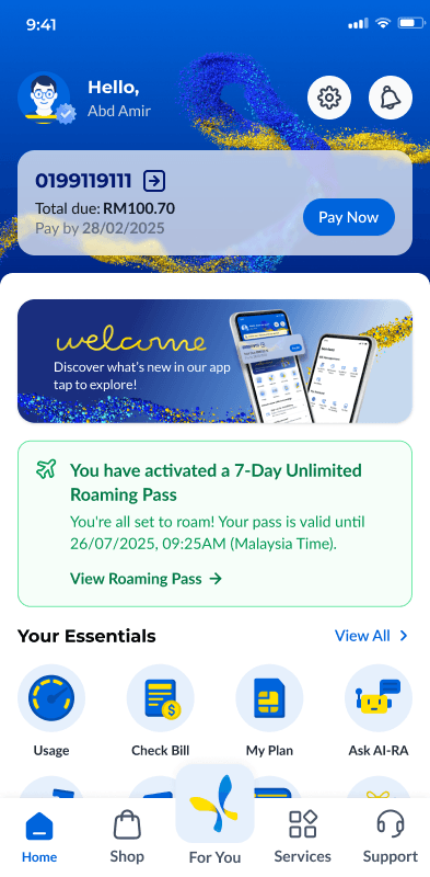
Total due RM100.70
Pay by 28/02/2025
Pay Now7-Day Unlimited Roaming Pass activated
You’re all set to roam!
50.8 GB left
of 100 GB · expiring in 30 days
Chat with us 24/7
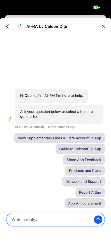
Our AI bot answers in seconds
Ask AI-RAThe brief
Two customer bases, one new app.
Celcom and Digi customers arrived with different accounts, plans and habits. Rather than patch an old app, we started from a blank page: which features every customer needs, how they are organised, and how the app should look and feel.
Process
From a blank page to the mass market.
- 1
Features
Decide what the app must do on day one, and what comes after.
- 2
UX & structure
Map the flows and group every feature into five main tabs.
- 3
Visual language
Set the UI style, icons and illustrations on the DotLabs system.
- 4
User testing
Put prototypes in front of real customers and fix what they struggle with.
- 5
Heuristic review
Check key screens against usability heuristics before build.
- 6
Launch
Release to the mass market, then keep improving with each update.
Features
Built around what customers do every day.
Manage everything
Every Celcom and Digi number, bill and balance on one home screen.
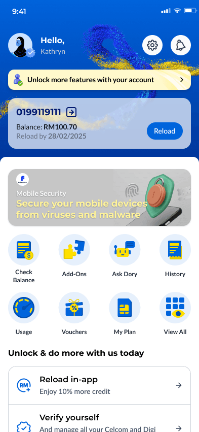
Pay and reload
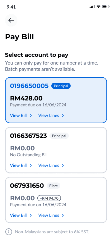
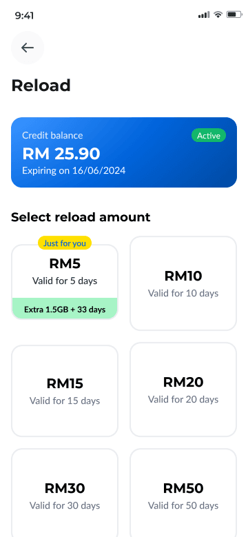
Pay bills or reload for yourself and others in a few taps.
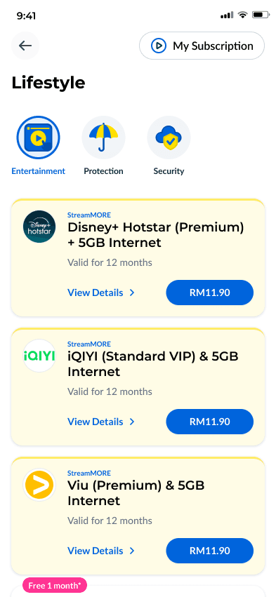
Stay entertained
Streaming bundles like Disney+ Hotstar, Viu and iQIYI with data.
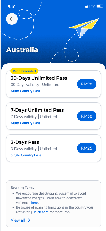
Travel smarter
Pick a destination and a roaming pass before you fly.
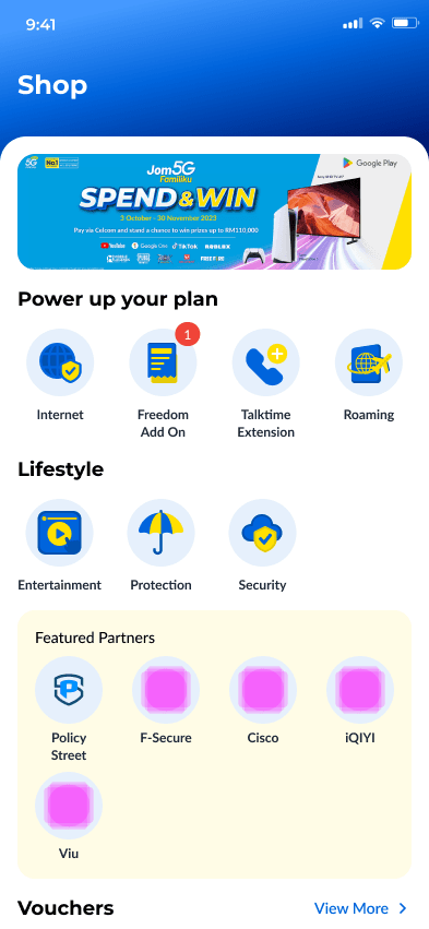
Shop and save
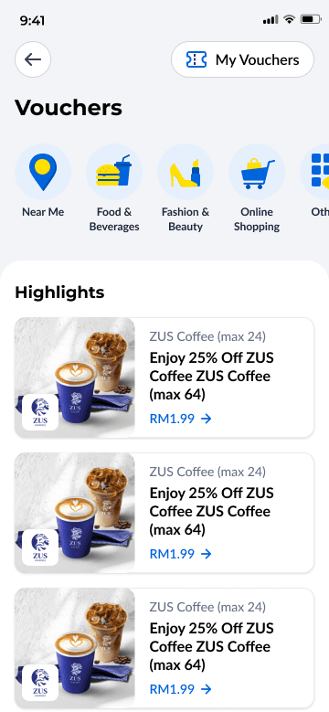
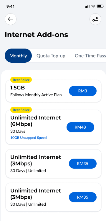
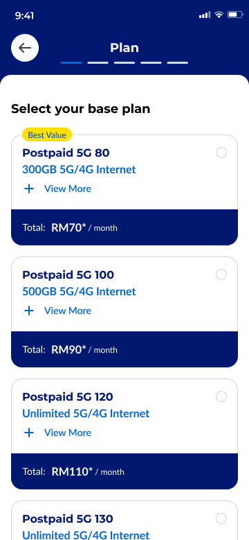
Plans, add-ons and vouchers from partners, all in the Shop tab.
Always-on help
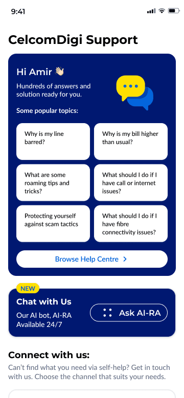
Popular answers, AI-RA chat and every support channel in one place.
Home
The home screen answers "what do I owe, what do I have?"
Account card first
The number, the amount due and the due date sit at the top, with "Pay Now" beside them.
Status, not surprises
Active passes, like a roaming pass, show up on home with their end date.
Your essentials
Usage, Check Bill, My Plan and Ask AI-RA are one tap away.
Support
Help without the queue.
Popular topics
The questions people ask most, like a barred line or a higher bill, are answered up front.
AI-RA, 24/7
An AI chat bot handles the rest, any time of day.
Every channel
WhatsApp, store finder, scam reporting and network coverage are listed below.
Research
Tested with real customers.
We did not wait for launch to find out what worked. Major flows were tried by real users and reviewed against usability heuristics before release.
Usability testing
Real Celcom and Digi customers tried everyday tasks on the designs, so we could see where they hesitated.
- Real customers, not just the team
- Everyday tasks: pay, reload, find help
- What we learned shaped the next design round
Heuristic evaluation
Key screens were reviewed one by one against Nielsen’s ten usability heuristics.
- Home, Shop, Pay Bill, Reload, Roaming and more
- Ten heuristics per screen
- Issues fixed in the design before build
Heuristic evaluation
Ten rules, every key screen.
The questions each screen had to answer, from Nielsen’s ten usability heuristics.
- H1
Visibility of system status
Can people always see their balance, due date and what is happening?
- H2
Match with the real world
Does it use the words customers use, not telco jargon?
- H3
User control and freedom
Can people go back, cancel or change their mind easily?
- H4
Consistency and standards
Do the same things look and work the same everywhere?
- H5
Error prevention
Does the design stop mistakes before they happen, like paying the wrong number?
- H6
Recognition over recall
Are options visible, so people don’t have to remember them?
- H7
Flexibility and efficiency
Can frequent users get things done faster?
- H8
Minimalist design
Does each screen show only what the task needs?
- H9
Recover from errors
Do error messages say what went wrong and how to fix it?
- H10
Help and documentation
Is help easy to find at the moment it is needed?
Visual language
An icon built on a grid, dressed for every season.
The app icon is drawn on a 1024 px construction grid and exported for iOS, Samsung squircle and round masks. Seasonal versions celebrate festivals like Chinese New Year and Hari Raya.

 Default
 CNY 2026
 Raya 2026

Outline and filled
Tab icons are outlined when unselected and filled when selected, so the current tab is obvious.
The brand at the centre
"For You" uses the CelcomDigi mark itself, placed in the middle of the tab bar.
Deep dive: login
Two customer bases, one front door.
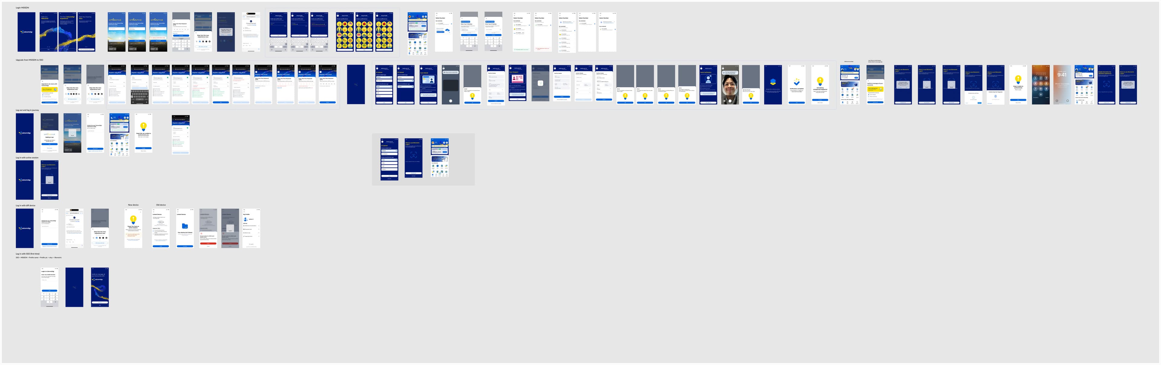
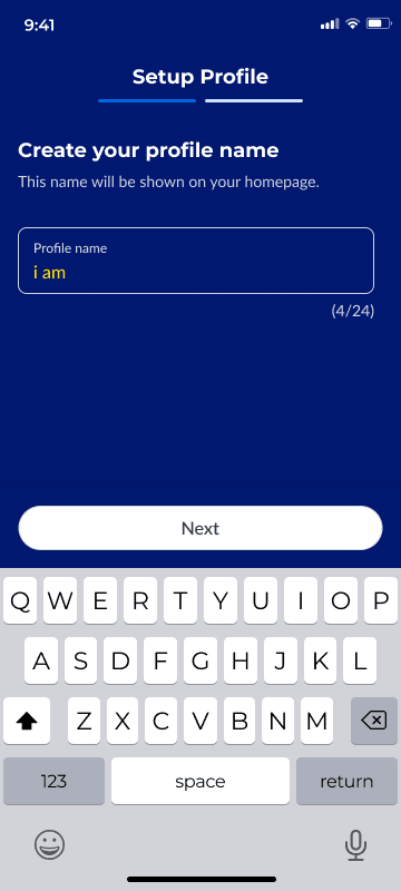
Customers arrived with a Celcom or Digi account, one or many numbers, and sometimes a line that someone else in the family paid for. The login had to recognise all of them without asking people to start over.
Key decisions
Meeting people where they are.
- 01
Sign in the familiar way
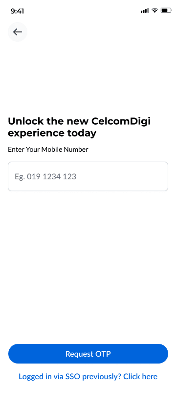
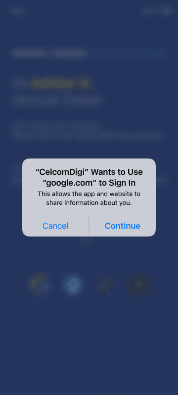
People can log in with their mobile number and a one-time password, or link Google, Facebook, TikTok, X or Apple.
- 02
Recognise returning users
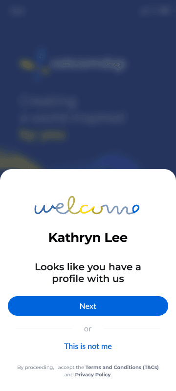
On a known device the app greets people by name ("Looks like you have a profile with us") instead of asking for details again.
- 03
Find every number
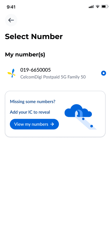
Principal and supplementary lines are listed together. If a number is missing, people can add their IC to reveal it, with eKYC for the lines that need it.

Launch
4M+
users on the CelcomDigi app
Launched to the mass market and still growing with every release.
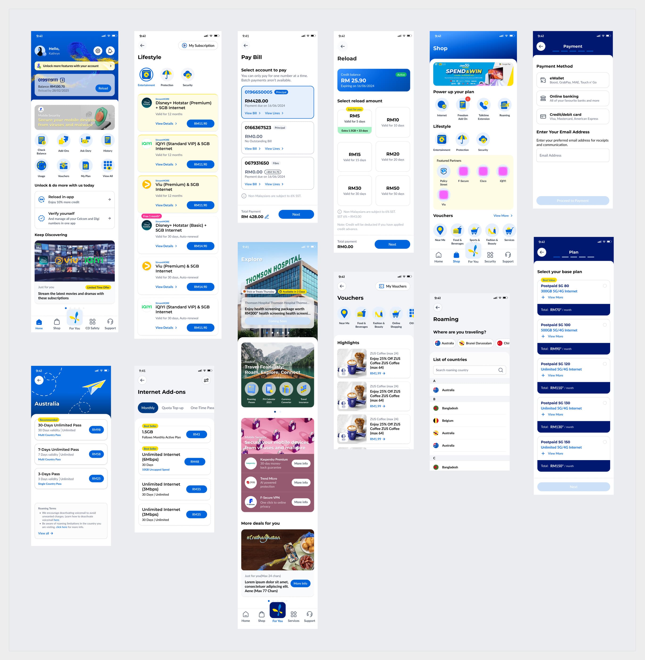
- Postpaid home
- Pay Bill
- Reload
- Shop
- Lifestyle bundles
- Roaming passes
- Vouchers
- Support
- AI-RA chat
- Internet add-ons
- Select base plan
- Prepaid home