CelcomDigi
Spark by CelcomDigi
A fully digital mobile brand, designed from the logo to the last screen.
Spark is CelcomDigi’s fully digital mobile brand, launched in 2025: order a SIM or eSIM, activate it and manage your plan, all in the app. Under Project Nova I created the brand from scratch, from the logo through the UX and the final UI of the relaunched app, so the brand and the product were designed together.
- Client
- CelcomDigi
- Year
- 2025
- My role
- UX/UI, design system and brand creation
- Platform
- Brand identity · iOS & Android app
The brief
A digital brand inside a big telco.
Project Nova created Spark as a new sub-brand under CelcomDigi for digital-savvy users. It had two goals: sit clearly under CelcomDigi’s identity, and attract a new, more lifestyle-oriented audience.
The ambition was clear: Malaysia’s first 100% self-serve telco platform, with no queues, no shops and no calls. The design principle followed from it: minimal effort, maximum empowerment.
The launch date was tight and the team was small. So on top of the UX and UI, I took on creating the brand itself and planning the app launch.
Brand direction
Three sparks. One shone brightest.
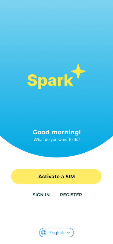
We explored three directions on the same welcome screen and compared them side by side.
- Option 1Chosen
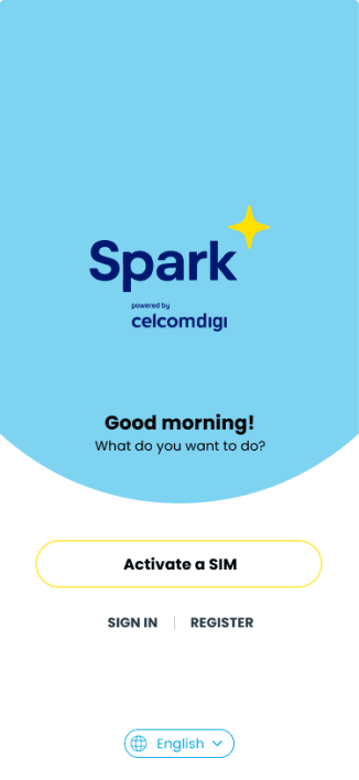
Pastel Vibrant
Young & vibrant
- Pastel tones drawn from CelcomDigi colours
- Friendly and playful for a younger audience
- Suits referrals, social and gamification
- Option 2
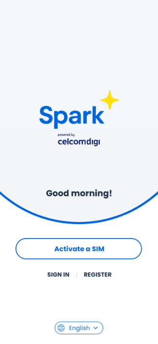
Clean & Professional
Balanced & professional
- 60% white, 30% bright blue, 10% yellow accent
- Clean layouts that keep content legible
- Appeals to the mass market and telco power users
- Option 3
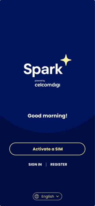
Dark & Sleek
Bold & trendy
- Dark mode for a sleek, immersive feel
- Premium and tech-forward
- Inspired by high-end digital products
Pastel Vibrant won. We refined it into the final look: a sky-blue gradient, a Spark Yellow wordmark and a bold yellow call to action, still built from CelcomDigi’s own colours.
Brand essence
Start strong. Stay in control.
- 01
Brand voice
Friendly, empowering and efficient.
- 02
Logo style
Rounded and approachable, with a hint of boldness.
- 03
The Spark icon
A yellow starburst that stands for starting something, like pressing "start".
Who it is for
Three kinds of customer.
- 01
Digital natives, 18–45
Want fast onboarding, theme personalisation and social login.
- 02
Budget-conscious users
Want control over their plan, no hidden charges and flexible add-ons.
- 03
Urban professionals
Want bundles, roaming and fibre add-ons in one place.
The final palette
Different, but still CelcomDigi.
Visual rules
One clear language for every screen.
- 01
Flat, friendly illustration
Clean 2D illustrations with no depth or heavy shading. Blue sets the scene and yellow is the accent, so the art never competes with the content.
- 02
Icons that show state
Navigation uses a filled blue icon for the active tab and a simple outline for the rest, so people always know where they are.
- 03
Plans at a glance
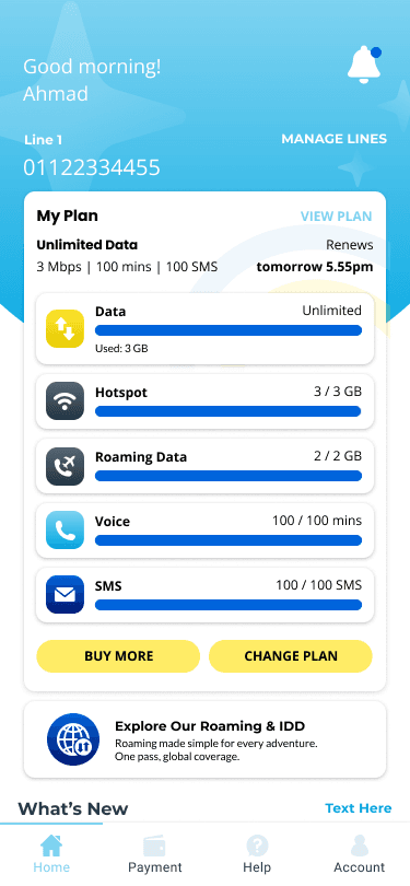
The home screen shows the plan and every allowance as a bar, with "Buy more" and "Change plan" one tap away.
Home
Your whole plan on one screen.
Every allowance at a glance
Data, hotspot, roaming data, calls and SMS each get a bar, so people see what is left without opening anything.
Top up or switch in one tap
"Buy more" and "Change plan" sit right under the usage, where the need comes up.
Travel ready
Roaming and IDD has its own entry on the home screen, one tap before a trip.
First launch
One clear first step.
Activate first
New customers arrive with a SIM or eSIM in hand, so "Activate a SIM" is the one big button.
Sign in or register
Returning customers and new sign-ups each have a quiet link below it.
Language on the first screen
The language switch is on the welcome screen, before any account step.
Roaming
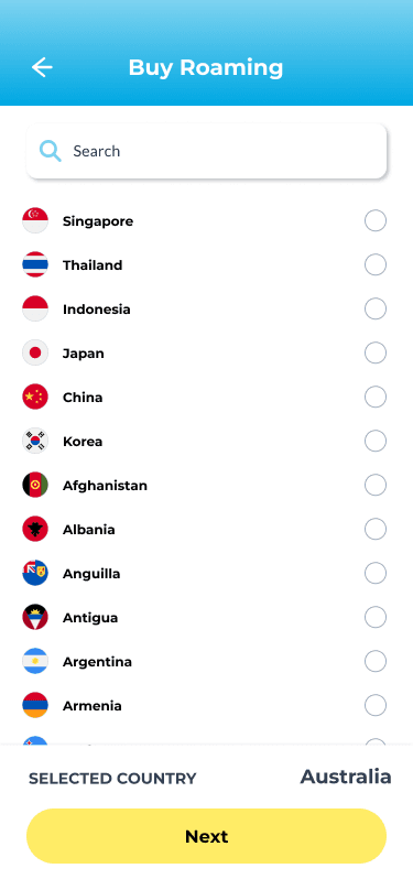
Roam 82 countries from RM4 a day.
Pick a destination
Search or scroll the list of 82 countries and choose where you are going.
Pre-purchase up to 60 days ahead
Buy the pass before you fly. It starts when you use data abroad.
Hassle-free activation in app
No store visit and no call centre: the whole purchase happens in the app.
Best local network, auto-selected
Land and go. The pass connects to the best local network for you.


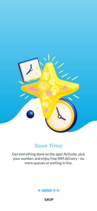
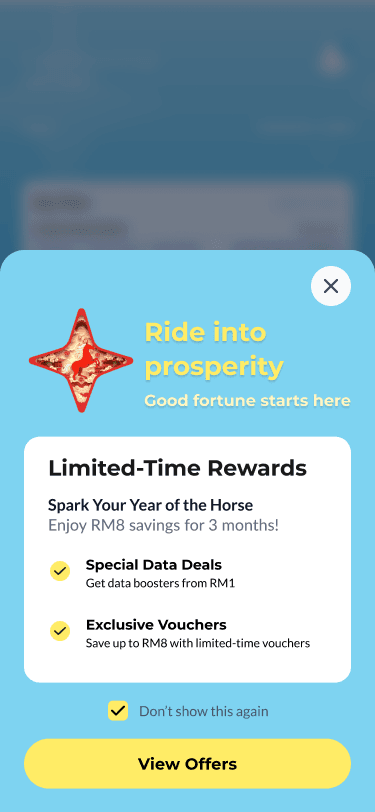
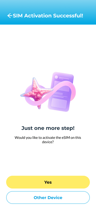
- Spark splash screen
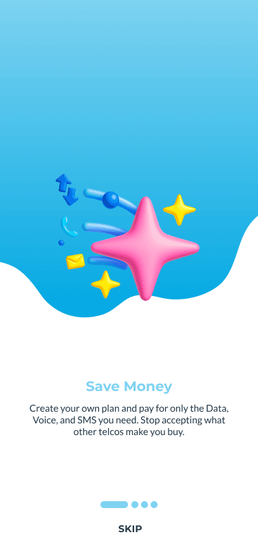
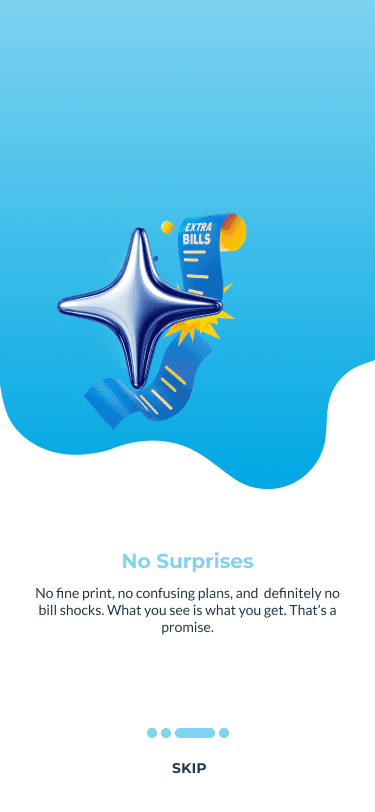
- Onboarding: Save Money
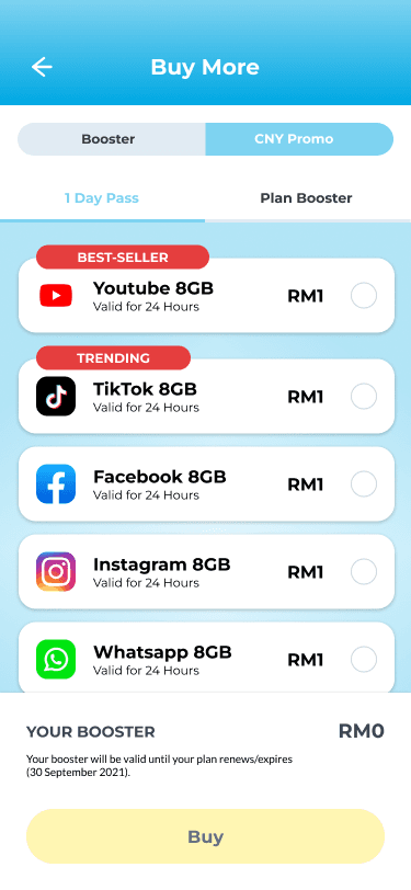
- Buy More: social data passes
- Onboarding: No Surprises
- Chinese New Year splash screen
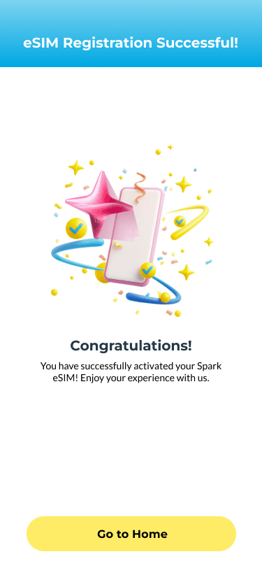
- eSIM registration successful
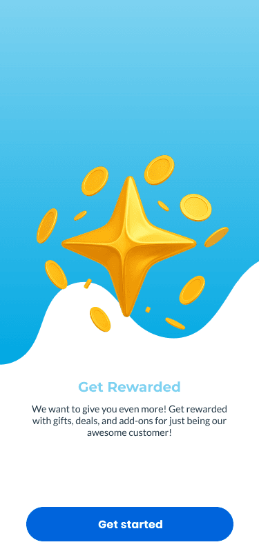
- Onboarding: Get Rewarded
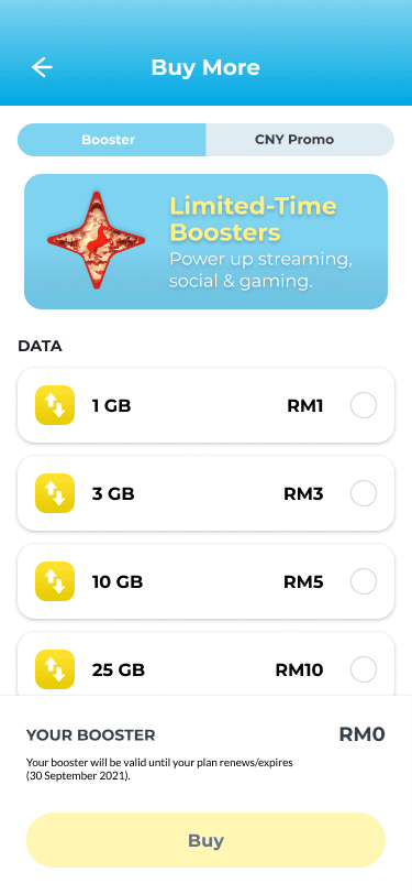
- Buy More: data boosters
- Joyful Seasons splash screen
- Onboarding: Save Time
- Limited-time rewards sheet
- SIM activation: one more step
Launch
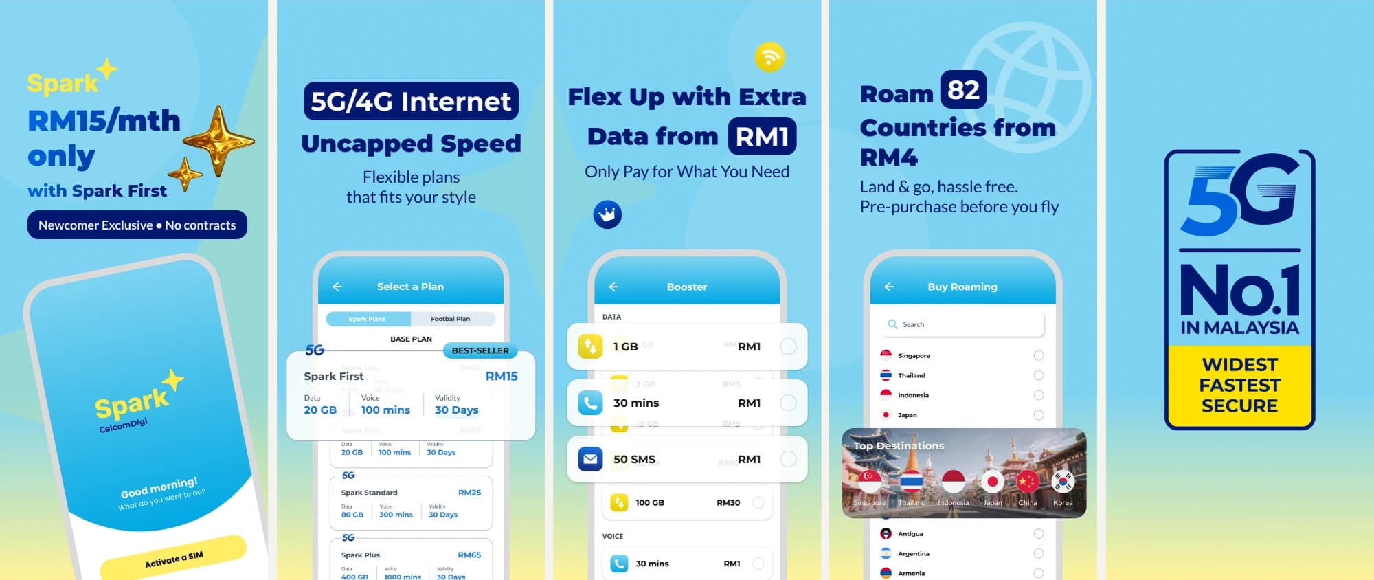
Telling the story in the App Store.
I also designed the store listing. Each preview sells one promise in a few words: RM15 a month with Spark First, uncapped 5G/4G internet, extra data from RM1, roaming in 82 countries from RM4, and Malaysia’s No.1 5G network.
Constraints & decisions
A new brand, on a deadline.
- 01
A tight launch date
The launch date was fixed and close, so the brand, the UX and the UI had to be worked on at the same time instead of one after another.
- 02
Owning the brand as well as the product
With very limited resources, I took on the brand creation myself: the logo, the identity and the brand guide. Because the brand and the UI were made by the same person, they were designed to work together from the start.
- 03
Planning the launch
I also planned the app launch, including the App Store listing, so the story in the store matched the product people would open.